#6 Presenting our radars: The dashboard (and finale!)
Hello! Welcome back for this last installment of this Making Percentile Radars project. There has been a bit of a gap between the last post and this final one - it marks my first foray into using the Shiny package in R!
This whole project has been a lot of fun and it’s fitting that the most enjoyable part, for me at least, was saved until last. I loved learning the basics of creating an interactive dashboard with Shiny and I want to go over my process for creating the dashboard, along with showcasing it too!
The Dashboard
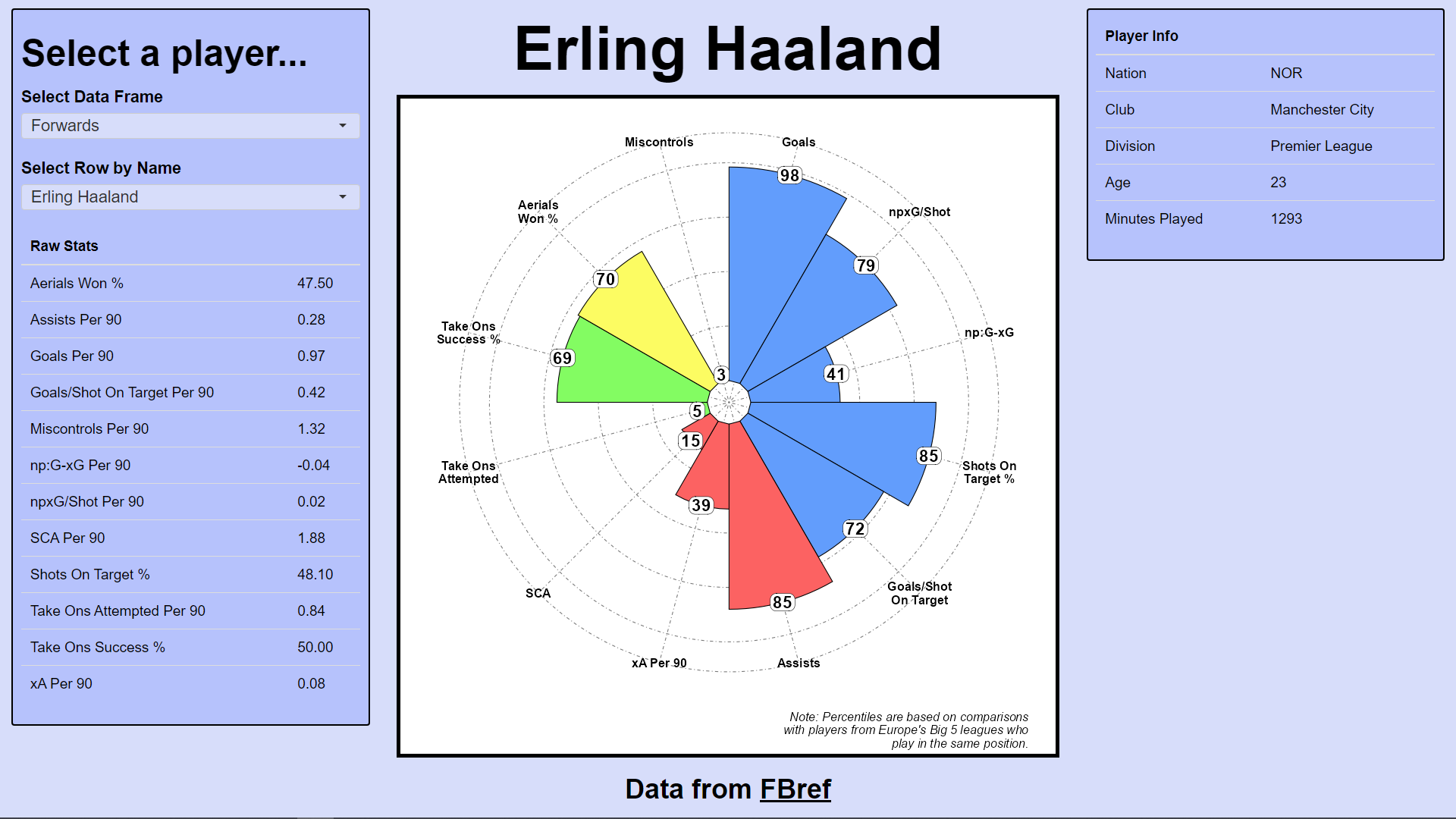
So the whole purpose of this project was to create and interactive dashboard to display percentile stats for male football players from Europe’s Big 5 leagues, using data from fbref. Let’s take a look at how I build this dashboard!
So to begin, Shiny applications, at their most basic, need two arguments in order to function: the UI to control the layout of elements on the dashboard and the Server logic to control interactive functions required to make the dashboard feel alive. Now, the code for this dashboard is quite long and so to avoid cluttering this post with 100s of lines of code, I’ll simply describe each section. The process begins with creating an app script (app.R).
The UI
In our app script, we start by creating an object called UI. We first assign the fluidPage() function to this UI object and within the function, outline the elements we wish to include on the page. We include a fluidRow() function and create two sidebarPanel() functions either side of a mainPanel() function.
The first of these sidebarPanel()-s contains two selection boxes. The first selection box is where the user chooses the positional category they want to look at: Goalkeepers, Defenders, Midfielders or Forwards. Once a position is selected, the content of the second selection box is determined. For example, if “Defenders” is selected, then only players from our data who are actually defenders will appear in this second selection box - the means by which this is achieved is found in the Server logic.
With a position selected, we can select any player we want, either by scrolling down on the dropdown menu, or typing their name into the selection box. Then, with a particular player selected, their information will be displayed in the rendered tables and, importantly, in the percentile radar plot!
The Server
Now, whilst we have positioned all of our page elements as we would like them to be arranged, the UI object cannot provide any interactivity in our dashboard. We want the dashboard to dynamically update based on user input. Let’s see how this is done.
Firstly, we use a reactive() function that contains a switch() function. This switch() function contains our 4 data frames corresponding to each position. When a user selects a data frame from the dropdown menu, this reactive() function saves the most recent selection in the selected_df object. This selected_df object can now be accessed by other elements in our dashboard and will be used immediately in the next step.
Next, we use an observe() function which - as the name suggests - observes any changes to the selected_df object. Specifically, this observe() function tells the second selection box - the player selection box - that it can only display players who play in the same position as the one currently selected in the first selection box. Now we need to actually provide logic for the player selection box itself.
The player selection box again uses a reactive() function (assigned to the selected_player object) which takes the selected data frame from selected_df and grabs the name of the selected player and just the percentile columns. If the player selection box is blank, this function returns NULL - since nothing is selected. But if a name is provided, the function selects the row from the data frame where the value in the “Player” column matches the name in the selection box, along with grabbing just the percentile columns. In combination, this gives us the necessary data to use when plotting the percentile radar of the selected player.
We also have two tables on this dashboard: one displaying basic demographic info about the selected player and one displaying the raw, non-percentile versions of the player’s stats. These tables are made by grabbing information using a similar approach to how we grabbed the data for the main percentile radar itself, instead we selected all the information that was not percentile data. This extra player information is then passed into two renderTable() functions which transpose the data frame into to columns to list each variable (e.g. Nationality, Age, Goals per 90 etc.) along side its associated value.
The raw stats are particularly important to display as percentile information, being a normalised ranking metric ranging between 0 and 100, does not tell us anything about the objective underlying numbers they are based on - a player may be in the 85th percentile for goals scored but how many goals did they actually score? This information contextualises the percentiles.
The last part of the server logic is the radar itself. A renderPlot() function is used, taking the output of the selected_player object as an input. In order to group oue metrics together into the categories outlined in previous posts and assign colours to these categories, two list object called percentile_radar_bar_orders and percentile_radar_bar_colours contain the orders of the radar bars and the colours assigned to them. These orderings and colours are selected reactively along with the selection of the data frames to ensure the correct orderings and colours are used for each positional category. GGplot2 is used to create a geom_bar() object to display the percentiles and then coord_polar() is used to almost wrap the x axis into a circle to create the radar shape. The end result is as you can see at the beginning of the post - an interactive dashboard displaying the percentile information of any player the user wishes to look at.
Final remarks
So that’s it! …for now at least. I have had a lot of fun working on this project and feel it has been a great experience for me to learn some new skills in working with data. As a football fan and data enthusiast, I also just get a kind of intrinsic enjoyment in exploring the sport I love using tools of a data analyst. I’ve always loved exploring visualisations in football from journalists and even video games such as Football Manager and gaining new insights into the sport from them. Being able to look at the sport on a more global level or delve deep into the performance of a specific player through data is incredibly interesting and fun for me - I’m sure this won’t be the last football-related data project I work on.
Passion aside for a moment, I do also want to reflect on how I feel this project helped me develop as a data analyst. Learning Shiny was a challenge but I now feel much more comfortable with the approach and really look forward to developing my understanding of the package in the future to create more complex dashboards and provide as much insight as possible for viewers. As for web scraping, the process is a lot simpler than I expected and it has opened up a world of potential to me - I’m sure it will become a core skill of mine moving forward and I am keen to utilise it along side more interesting applications such as automation. As for skills I had some experience with already, I feel integrating slightly more complex approaches to coding in order to clean and prepare data - such as utilising functions and list objects - helped me become more aware of more efficient and scalable ways to process data, something I feel will be important as I progress as a data analyst. Overall, I think not only was this project a lot of fun but also enabled me to build upon my experience from university and I’m only more excited to continue that development for it.
If you’ve followed along at any part of this project and are reading this, thank you very much! I hope my process was clear and enjoyable to follow, and that you have gained some insight into my approach. I’m aware that there is always room for improvement and I could possibly give myself feedback at some point in the future, but if you have any comments I would love to hear them - just send me an email or drop a message on LinkedIn. I’m always looking to improve and would really appreciate guidance from anyone who feels they are able to provide any. Thank you again for following along and looking forward to the next project!