#1 Overview: What are percentile radars?
Hello! Before we get started on this project, I just wanted to provide a background to it and explain what the overall aim is. This project has the goal of creating percentile radars. These visualisation are powerful tools, especially for analysing data in sports like football. Let’s go over what percentile radars are and what we’re looking to achieve with them here.
A percentile radar is a type of data visualisation which represent a given subject (i.e. a participant, a football player, a whole country etc.) and their position in the overall sample distribution across a variety of different metrics. Below is a rough sketch of what percentile radars look like:
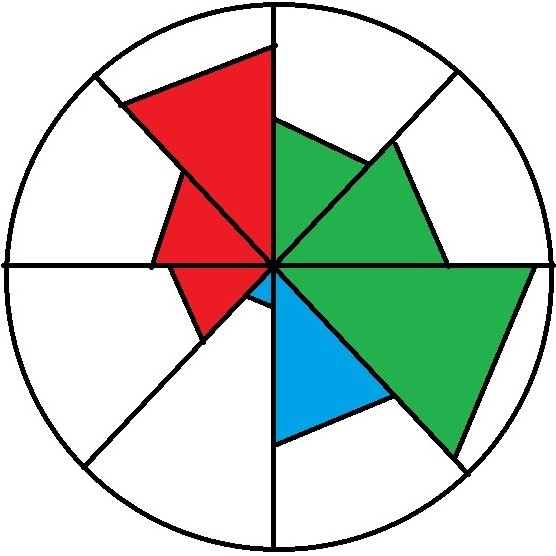
Each circle segment represents a given variable. A subject’s position in the distribution on a given variable is represented by the coloured section of the segments. If the coloured area fills the segment, the subject falls within the 100th percentile on that variable. Where the coloured area fails to fill the segment entirely, the subject falls within a percentile lower than the 100th (e.g. 75th, 50th, 25th). The different colours represent variables that fall within a similar over-arching category. For example, in the context of football, red might refer to defensive stats, whilst green refers to attacking/offensive stats, and similarly blue might represent possession-based stats.
The reason why, in my view, this form of data visualisation works so well for sports is that spectators, when judging the ability of a player do so by trying to consider the player’s performance across many different attributes at once and try to aggregate performance into an overall judgement of ability (I.e. “that player is good”, “that player is not as good” etc.). Despite such judgements seeming simplistic, they come from an informed perspective, where fans (myself included) have an intuitive understanding of what matters in judging a player’s ability. The percentile radar captures what fans already try to do but brings in statistics to add to the discussion. It does not crowd out how fans want to analyse players intuitively, it accommodates that intuition and yet still retains analytical power. To me, it is really important to make sure our use of statistics in football is not alienating to those who are not as interested in data analysis and may not be particularly data-driven in their approach to it. It is of course perfectly fine for fans to have this perspective, and I don’t seek to change it, but I think visualisations like percentile radars help to bridge that gap between the “analytic” fans and the “traditionalist” fans by giving them a shared language to discuss the sport they love.
I’m far from the first person to use percentile radars, despite not everyone using that term to describe them. However, I personally think they are great and believe it would be a fantastic place to start in an analysis project. However, I don’t simply want to create static graphs representing a particular player’s stats at a particular time, which is what is more commonly seen. I instead hope to create a dynamic visualisations that allows the user to choose the variables they wish to plot, the players they want to analyse, the sample they wish to draw from, and so on and so on. I think this more dynamic approach is more exciting and hopefully means this project can result in the creation of a useful tool for those interested in analysing the world of football with ease.
I’m looking forward to getting started and will be posting each stage of the project as and when I am willing and able to make progress on it. I’m excited to see how it turns out, and I hope you are as well. Of course, I encourage any constructive feedback you might have on my approach as I progress throughout the project.
In the next post, I’ll begin by getting the data we’re going to use and making it fit-for-purpose.
Thank you and I hope you enjoy following along!